My website: Layout
This website uses break points defined by the content itself to reorganise content in 4 different layouts.
Responsive layouts
What a struggle but 💪 eventually satisfied. This was essentially a challenge from my friend Nevan Scott: to embrace grid-template-areas and shuffle things around depending on resolution.
Also, I wanted to NOT use centered layout, even for big screens. Let me know if I pulled it out.
See also:
- My website: Responsive images
- My website: Typography (fluid scale)
- My website: Space scale (fluid scale)
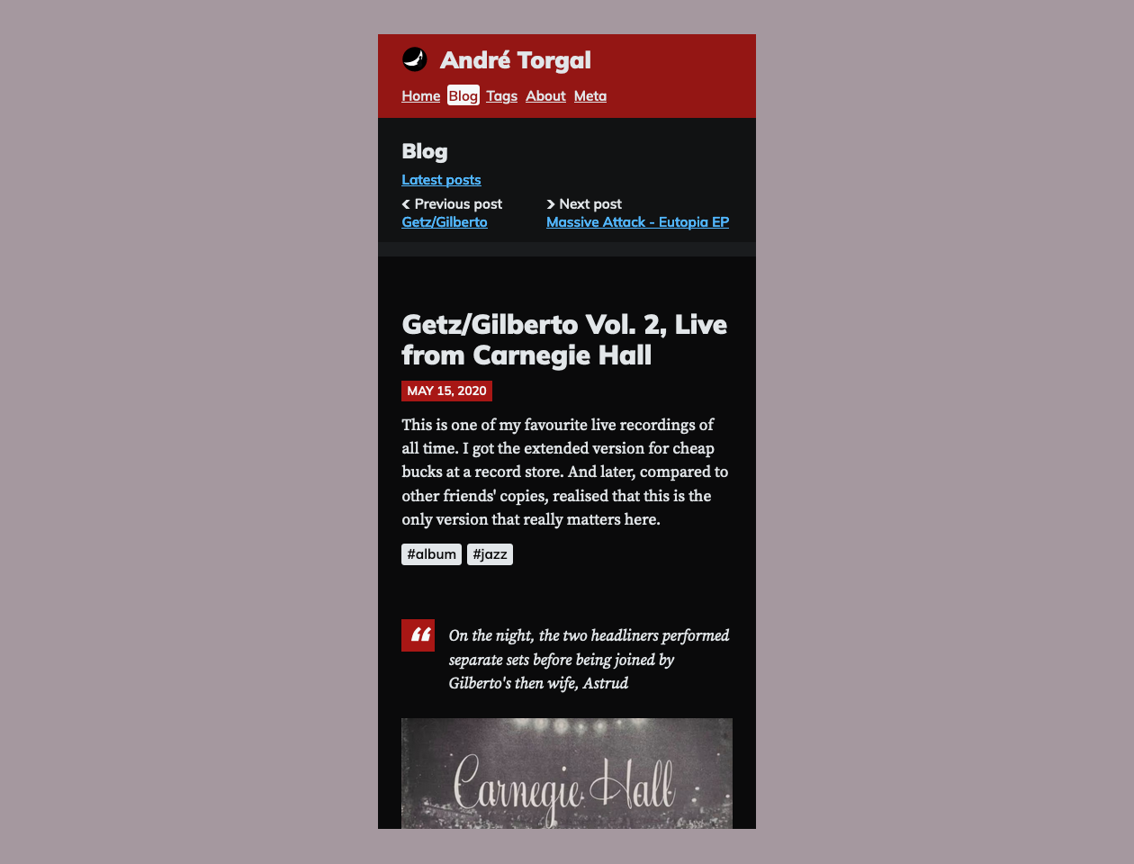
Small hand-held device
- 1 column, vertical, compact

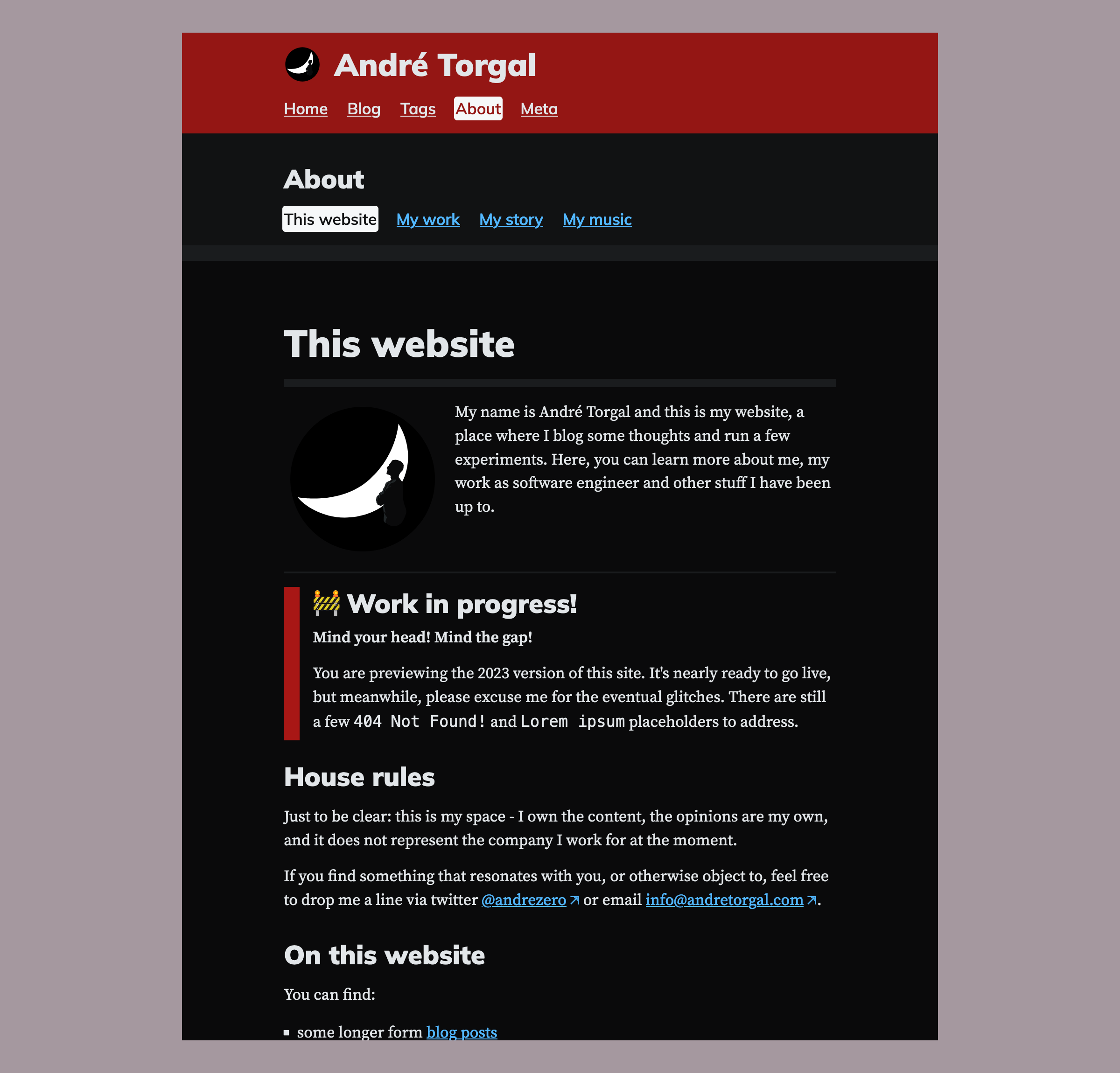
Medium hand-held > 620px
- 1 column, vertical, centered

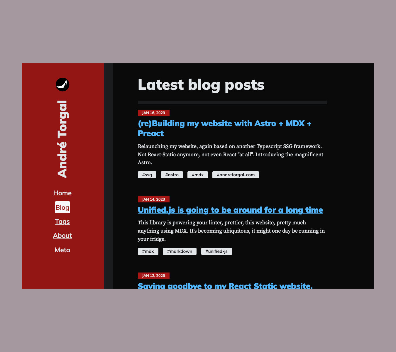
Tablets / small desktop > 1060px
- two column
- note:
writing-mode: sideways-lris only supported in Firefox

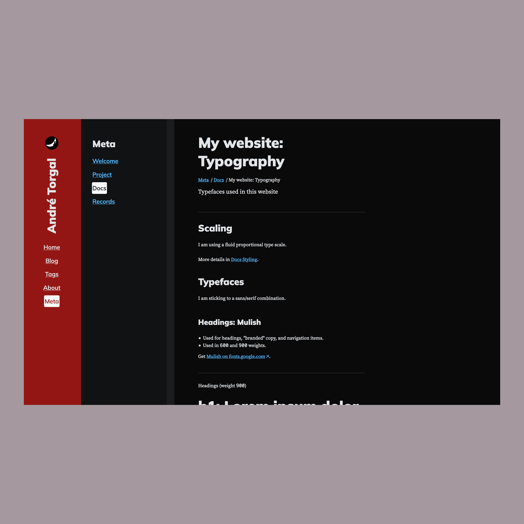
Large desktop > 1420px
- two/three column depending on the section of the site
